
Brief: To create an outcome based on the word identity.
Statement Of Intent
My initial thoughts on this task brings me to see that it is a very broad subject and could be branched out into a large variety of outcomes. In order to have a stabilised path to follow, I plan to fix my ideas to a set boundary. Seeing as focusing on my own specialism is an important aspect of the project, my idea is to create some sort of outcome based on people and their identities. This could be physically or psychologically, branching these into actual subjects would bring me to my final idea. From this, I could create a character design or an illustration to exemplify the differences of people and how identity makes a person unique, or even relatable to others who have similar attributes. My chosen idea is to do a character design which could be used for comic book purposes or for general use in an illustration.
The reason I have chosen this idea is because I think it would portray the message of identity and differences in such a way that makes it almost obvious how everyone differentiates from each other or can relate in some way or another. As well as this, it would also allow me to develop my drawing skill in more than just people and rather reach out to draw inanimate, everyday objects. I think that my current knowledge on basic figure drawing would certainly help in this choice but I will be looking further into this subject to further expand my knowledge on it.
Target Market
Considering that this character would revolve around their own interests, hobbies, jobs etc. I believe the target market would range from around 16-18, as this is the age of which people are quite self conscious and aware. This sort of links in with the way the character would look based on their own attributes that they possess.
****
Research
In order to achieve an anatomically correct outcome, I could research into basic anatomy in art to grasp the basic concept of the body and how it is made up. This would be added to my slight knowledge that I have on this subject. Another bit of research that would be useful is to explore the use of collages to create objects or people.
Sandra Chevrier
Sandra is an artist living in Montreal, Quebec who creates hyperrealistic paintings of women who seem to wear masks made up of collaged bits of comic book pages.


Her artwork is quite unique, even though she may just paint portraits, she adds a touch of her own inspiration to create these iconic pieces. The difference between the hyper-realistic painting and the collaged comic book pages adds a sense of childishness to her artworks, as though a child has made a mask from old bits of comic pages. Not necessarily meaning this is her aim, but it gives me the idea that she’s attempting to mix media in such a way that would potentially cause viewers to come up with the same interpretation.
According to ‘thinkspaceprojects.com’, the actual aim of her artworks is to illustrate the struggles of how women are expected to be part of these almost superhero-like beauty standards. Though they aren’t expected to be actual superheroes, it is the metaphor of having superhero abilities, to be perfect and able to do anything. She calls this series ‘cages’ which, as self explanatory as is it, shows that it’s like being trapped in this scenario as well as women ‘trying to find freedom from society’s twisted perception of what women should or shouldn’t be.
In relation to my own idea that I plan to create, I could use the idea of collaging to build my character/characters to explore the media available for me to use rather than going completely digitally or traditionally throughout the entire piece.
Source(s):
https://thinkspaceprojects.com/artists/sandra-chevrier/
https://www.sandrachevrier.com/
Ideas
https://www.youtube.com/channel/UCMymh35-JHoOa8YaPSkCmKQ
Riven Phoenix has an interesting take on how to draw the basic skeleton needed to create a proportional human body. He uses only circles and lines to make the first layer, the skeleton, and from this you can create the form of the person to be correctly proportionate. It also allows the character to be more organic rather than have a stiff gesture due to the way the parts are drawn. His method mixed with my knowledge of figure drawing, has brought me to create these basic forms.


I first drew a standard standing pose from the side and front to grasp the general sizes of each part of the body. Though they aren’t perfect, it would still enable me to create characters made up of different physical objects to form at least a legible human form.
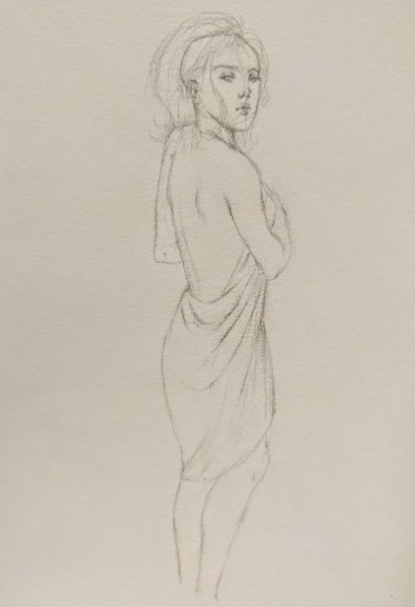
As well as the basic forms, I drew out a figure from my mind to see if I’m able to draw a slightly more complex pose rather than just looking straight forwards of from the side directly. In order to construct this pose, I started out with simple shapes and lines to gather the basic shape and gesture of the body, From this, I used what I knew to create the actual form of the body. In terms of critique, I can see that the head is a little large as oppose to the rest of the body, so in future I should keep this in mind (if I was to draw a normal head on the character rather than an object itself). In conclusion, I think I would be able to make a decent pose of a person in anything they are doing, which would fit well with any scenario that it would need to fit into.
Using what I learned, I created a basic idea for what my final character would look like.

As it is just a brief idea, I used random items that the supposed character would have an interest in, or use often. The form consists of things like musical instruments, to show interest in music, the front of a bike, to show interests in biking and so on.
The whole message that my character design would portray is how everyone has their own ‘identity’ and that makes them different. The play of ‘Human Mind’ comes in through social responses to how everyone is different and how people react to each other’s differences, which would be relatable, disliked or not cared about.
My final idea is where two people are on a romantic or friendly date, talking and they both hold their differences but have similarities in interests, which both bring them to relate to each other and bond. This shows identity is unique to people themselves but also is shared with others that can bring people together – which also links in with the human mind, how we think of people and people think of others. From this, I decided that using traditional media wouldn’t be necessary and I’d rather make it all digital as it is to be an illustration. In order to use an idea from Sandra Chevrier, I could still use collaging but where each item is drawn rather than taken from pages or magazines.
Process

Firstly, I used what I learned about drawing the human form to sketch out a base for the bodies and the positions of which they would be in – sitting. I used simple shapes to plan out what each part of the body was doing, for example the legs, what the arms were doing etc. Once I made my basic plan, I made the line work for the actual shapes and forms.
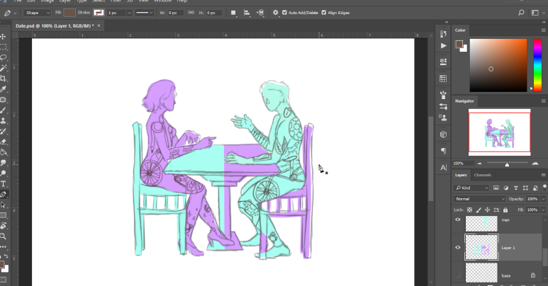
After the line work, I drew in their interests and hobbies, some being very different and a couple being the same so they have something to relate to. As I wanted to go for a solid, flat style, I used the pen tool to add colour to the people and items. I chose two colours, one for each person and used the same colours on the opposite sides. The reason for this is because I wanted to illustrate how they are different but can share those ‘differences’.

I removed the line work to see the outcome and fix up and gaps I may have left, and transformed some items like the chairs to fit and sit right.

To bring the whole image together, I wanted to make my own background, so I decided to go for a geometric kind of design. I made a square with a simple design in it using just the ellipse tool and the rectangle tool. I chose a yellow-ish kind of colour to slightly contrast the main colours of the scenario. I then grouped the shapes together and duplicated them multiple times and lined them up. I grouped these together also and repeated the process to fill the page.

I wasn’t too satisfied with my choice of colours so I chose the layer, went to Image > Adjustments > Hue & Saturation and played around with the options until I thought it looked better. After this, I further edited the colour by going into Image > Adjustments > Levels and made it slightly darker and saturated.
I came up with quite a few outcomes and thought they all looked pretty good. Some of them have a thin, black stroke around the scenario and others with a different background.
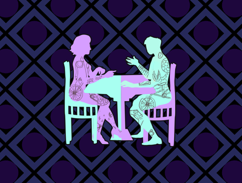
My complete final outcome is this one, with the darker, rotated background design and the stroke around the main image. The reason for this is because it allows the main image to stand out more and bring all the focus towards the centre, rather than having it all stand at one level. It’s a subtle tone but is still effective and gives the background a bit of energy.
Overall I think the outcome is how I wanted it to be and portrays the message I want rather clearly. I believe the choice of colours are good but could have perhaps been more contrasting rather than quite similar, this would really emphasise the idea of ‘differences’. Considering my target market – being 16-18 – I think it has the right tone to really appeal to this group because it could be quite a relatable scene as this is the sort of age where connections start properly.
